Your Groups on

Catalyst.

New feature to a digital learning platform that helps leaders and teams enhance connection and improve team dynamics.

Your Groups on

Catalyst.

New feature to a digital learning platform that helps leaders and teams enhance connection and improve team dynamics.

Your Groups on

Catalyst.

New feature to a digital learning platform that helps leaders and teams enhance connection and improve team dynamics.

Your Groups on

Catalyst.

New feature to a digital learning platform that helps leaders and teams enhance connection and improve team dynamics.

Role

Lead UX/UI Designer

Responsibilities

User research, information architecture, wireframing, prototyping, graphics, UAT, hand-off

Tools

Figma, Adobe Illustrator, Heap, Pendo, Jira


Figma, Adobe Illustrator, Heap, Pendo, Jira

Duration

6 months

What is Catalyst™?

What is Catalyst™?

What is Catalyst™?

Catalyst™ is a digital learning platform that helps people and teams work better together in organizations of all sizes. By integrating Everything DiSC®, a leading behavioral assessment tool, into colleagues’ work life through insights and problem-solving tools, Catalyst helps people better understand themselves, others, and solve interpersonal problems.

The problem

The problem

The problem

Despite its initial success in capturing interest, Catalyst user retention dropped off after the first 30 days. Learners, initially captivated by the platform's promise of personalized insights and team reports, were disengaging due to missing features and a lack of interactive content. As the Lead UX Designer on the project, I guided my team to focus on finding common themes for why our users might leave. What factors would create a need for reengagement? Is there anything that’s currently working?

"How might we introduce engaging features to ensure sustained user interest and ongoing value in their Catalyst journey?"

"How might we introduce engaging features to ensure sustained user interest and ongoing value in their Catalyst journey?"

"How might we introduce engaging features to ensure sustained user interest and ongoing value in their Catalyst journey?"

The solution

The solution

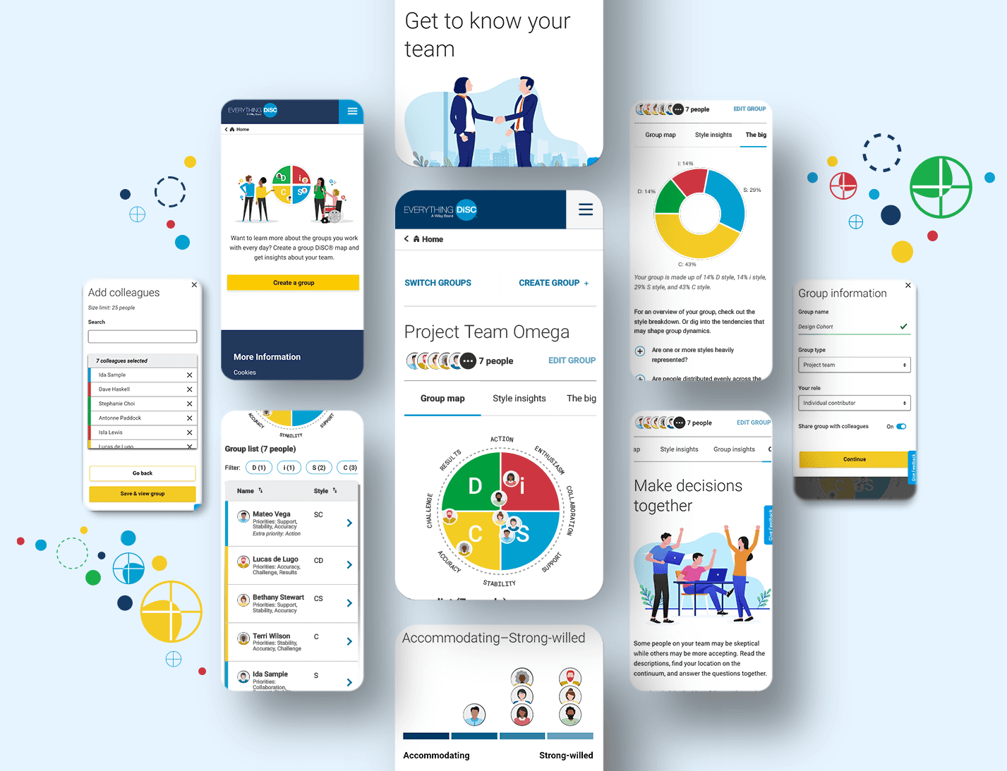
My team and I interviewed learners and stakeholders, reviewed feedback, and analyzed site metrics to uncover findings about user behavior. I then prioritized key items deemed critical to reengagement and implemented them by designing a new feature called “Your Groups on Catalyst”. This feature was created to meet the demands of users who sought a more robust, team-oriented experience. Learners on Catalyst could now visualize themselves and their colleagues on a group map, learn about their team dynamics, and navigate important conversations between team members in a more interactive way.

Sneak peek: final designs

Sneak peek: final designs

Sneak peek: final designs

Research and discovery

Research and discovery

Our journey began with a comprehensive exploration of user behavior post and during the 30-day mark. Through user interviews, behavioral analytics, and surveys, we built our understanding of user needs and expectations. We uncovered patterns and identified the pivotal features users wanted.

Step 1 - Listen to feedback

Step 1 - Listen to feedback

One of the most common innovation requests we received from our clients - at least one email/call a week to our Partner Success team - was for a “group map” feature—something users knew was already on the Everything DiSC website. Incorporating the feature was a quick fix; why not build out this feature into a more interactive and valuable experience?

Step 2 - Look at metrics

Step 2 - Look at metrics

Step 2 - Look at metrics

Step 2 - Look at metrics

While it seemed clear that we needed to include a "group map" feature on Catalyst, we also wanted to dig into why the platform was struggling with user retention. How bad was it? Well…

After 30 days, 93% of learners do not return to our platform. 

After 30 days, 93% of learners do not return to our platform. 

Ouch, that’s pretty disappointing, right? Yes, but there’s a lot to unpack here.  

Ouch, that’s pretty disappointing, right? Yes, but there’s a lot to unpack here.  

Based on our research, we believe that most platform usage is driven by the learners' need to complete their DiSC assessments and attend a facilitation. At the time, there wasn’t much interactive content beyond the assessment, so once compete, there was no reason for users to come back.

So is there anything that is working?

So is there anything that is working?

Yes! We have been able to find some interesting insights regarding what makes learners more likely to return. Specifically, we see that interacting with colleague cards and participating in a facilitated session in conjunction with the Catalyst experience impacts the likelihood learners will return.

(A colleague card provides a quick snapshot of your co-workers. You can see their DiSC style, DiSC priorities, job title, photo, and get more in-depth information by clicking on the card.)

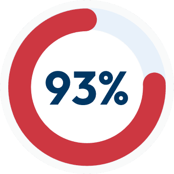
75% of learners who click on a colleague card return for another session that same week vs. 61% return rate for learners who don’t.

Digging deeper, 34% of all pageviews are the colleague feature, and 4 colleague cards are typically clicked per view. Why do colleague cards pique learners’ interest?


Additional research suggested our learners are curious not only to learn about themselves, but maybe even more importantly, want to know more about their team members and how they relate to each other. Let’s be candid: They want the information and they like accessing it without anyone knowing it.

Design

Design

Early exploration and user testing

Early exploration and user testing

The early stages of design began with sketches and outlines of possible features. I brainstormed everything from having a “Groups Dashboard” with detailed information about your teams and team dynamics to a more centralized “hub” that would contain a place for not only team activities, but also insights on your different cohorts, visuals of your teams’ style breakdowns, and even tips for overcoming specific problems.


Below, flip through some of the mid-fi prototypes that were later user tested.

  • Idea 1

    A group map with a list and a few poignant tidbits about the group makeup. In this version, you get access to a group map of your team, along with interesting bites about your team dynamics. This is geared at the learner who wants to get to the point and learn a few insights about their team composition without doing much work.

  • Idea 2

    One glaring problem with the group map is that it can get crowded and lose its meaning if there are too many people plotted. This idea allows you to still see team compositions, but in a much less disruptive way – with a simple donut chart of your team styles! There would still be quick bites about team dynamics with clear callouts about the different styles. It would also feature a summarized look of the behavioral tendencies of your team – another feature that many of our clients asked about.

  • Idea 3

    Focus on the map! Since we had an overwhelming demand from our clients for a group map feature, this idea is solely about that. The learner would be able to get a detailed view of not only a map, but a group list. To circumvent the problem of the map getting too crowded, I proposed collapsing populated areas into “bubbles” which the learner could then expand and zoom in by clicking on them. In addition, since we know that the colleague cards feature (along with the colleague page) is very popular for our learners, I wanted to link the two together through the list.

  • Idea 4

    The last version involved creating a “Groups dashboard” where learners could get a little bit of everything. The learners would see their team style breakdown in a donut chart so that they're not overwhelmed by all the dots on the map and would get insights of their overall team dynamics. For those who want more, they could explore a detailed map view, take a look at the different team behaviors and tendencies, and have an interactive section for activities that team members can do together. Remember all the rave about the colleague cards? I thought that this would be a great place to bring them in again, but specifically just for the members of the particular team.

Narrowing down features

Narrowing down features

Once we had some initial wireframes ready to go, we implemented a user test for the various features we wanted to include. The feedback from the test revealed that our users gravitated toward the following features:

1

Group map and list

Group map and list

As expected, this was our most popular feature. People wanted to not only view their teammates on a map, but also to see a list version of the DiSC map.

2

Style insights

Style insights

A place where you can dive deeper into each person’s style and get a better understanding of what people with a particular DiSC style care about. This was especially popular with learners who were DiSC novices.

3

Group insights

Group insights

Another popular feature that emerged from the testing feedback was the Group insights section. With this feature, users could see a style breakdown in graph format of their team. We heard the feedback that this especially helped larger teams to understand their team dynamics at a glance.

4

Conversation starters

Conversation starters

This feature was especially requested by managers and team leaders who wanted to find simple ways for their teams to connect and get conversations going. This feature allowed for important team discussions and also instilled a sense of collaboration and belonging especially for those who work in virtual teams.

Final Designs

Final Designs

Taking all that we learned, and all the limitations we had, we decided to create a centralized “hub” for all features related to groups.

The feedback was clear - people didn’t want to go to different links and pages to get relevant information about their team, they wanted it all in one place!

This is how Your Groups on Catalyst was born – a centralized hub for all of your team needs. Flip through the designs below to see them in action!

This is how Your Groups on Catalyst was born – a centralized hub for all of your team needs.


Flip through the slideshow below for final mobile screens!

  • Easy group creation

    Users can seamlessly create new groups without leaving the Groups home. Simple interactions guide users through the creation process, with clear error messages and notifications. Easily search for the colleagues you wish to add and review your list before creating the group.

  • Tabbed content

    User testing revealed that people liked a centralized location for group related content and didn't want to navigate to various places in the platform. I decided to split up the key features into tabs with clear labels for included content.

  • Insights for larger groups

    Group insights is meant to visualize your group style breakdown in an easy-to-digest way by turning the DiSC map into a graph view. Salient insights of the group help to guide conversations. Team tendency continua help to visualize the similarities and differences of your team.

  • Quick access to colleague details page

    It was revealed in our research that the colleague cards and colleague details page is the most used content on our platform. Keeping that in mind, we wanted to provide an easy way to link people in the new group list to the colleague details page.

  • Easy Group Creation

    Users can seamlessly create new groups without leaving the Groups home. Simple interactions guide users through the creation process, with clear error messages and notifications. Easily search for the colleagues you wish to add and review your list before creating the group.

  • Tabbed Content

    User testing revealed that people liked a centralized location for group related content and didn't want to navigate to various places in the platform. I decided to split up the key features into tabs with clear labels for included content.

  • Helping large groups get insights

    Group insights is meant to visualize your group style breakdown in an easy-to-digest way by turning the DiSC map into a graph view. Salient insights of the group help to guide conversations. Team tendency continua help to visualize the similarities and differences of your team.

  • Quick access to colleague details

    It was revealed in our research that the colleague cards and colleague details page is the most used content on our platform. Keeping that in mind, we wanted to provide an easy way to link people in the new group list to the colleague details page.

Challenges

Challenges

While this was a good path forward, we ran into some snafus and limitations. With a short timeline and fewer tech resources than anticipated, we had to simplify the map experience. I initially proposed making the map interactive and zoomable, which would help larger groups digest the map, but since this was not feasible at the time, we had to save it for a V2 and go with a simpler solution of putting limits on the size of the group a team could create. We did more research and it turned out that the average number of learners on a team was only 12. Therefore, we extended the max limit to 25 just to be on the safe side.

Reflect

Reflect

What we know so far - the (early) data is in!

What we know so far - the (early) data is in!

How are learners reacting to the new Groups feature? In our site intercept survey, we asked learners who have created a group to indicate their satisfaction with the new feature, and so far, the news is very positive.

90% of learners surveyed indicated that they were either “Satisfied” or “Very Satisfied” with the new Your Groups feature.

90% of learners surveyed indicated that they were either “Satisfied” or “Very Satisfied” with the new Your Groups feature.

In addition…

In addition…

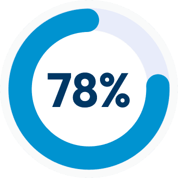
Active users who view Groups content had more than twice as many sessions per month as compared to all monthly active users (7 sessions vs. 3 sessions)

After a week, 78% of Your Groups users had another session.

After a week, 78% of Your Groups users had another session.

Compared to 57% of all other active users who weren't using Your Groups.

Compared to 57% of all other active users who weren't using Your Groups.

Why are learners creating groups?

Why are learners creating groups?

Why are learners creating groups?

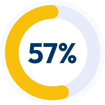
In the intercept survey, we also asked learners to select the reason that best describes why they created the group(s) that they did. So far, most people (39%) say that they wanted to see the DiSC map with everyone on it. With the other top reason being “I wanted to see if it might help me work better with a group of people” (32%) and a good chunk of learners saying that they just wanted to test it out (22%).

It was also interesting to see that the Group map has significantly more learners who indicate the Group map feature is “Very useful”.

What our learners are saying -

What our learners are saying -

“When you understand the categories, how they interplay, how you would tweak your approach to each person's characteristics, this high level, complete picture is a perfect “at a glance” reminder of what skills to use and with whom.”

“When you understand the categories, how they interplay, how you would tweak your approach to each person's characteristics, this high level, complete picture is a perfect “at a glance” reminder of what skills to use and with whom.”

“I like the ability to quickly review the styles of our team before joining a meeting. Especially one that might be a more difficult meeting.”

“I like the ability to quickly review the styles of our team before joining a meeting. Especially one that might be a more difficult meeting.”

“I think being as self aware as you can be is useful so that you can monitor and adjust how you show up to others at work. I also find it useful to understand others' style and how I might better serve them as a manager or team member.”

“I think being as self aware as you can be is useful so that you can monitor and adjust how you show up to others at work. I also find it useful to understand others' style and how I might better serve them as a manager or team member.”

Going forward…

Going forward…

While the data is still coming in, we are seeing positive impacts on our return and learn. We’re also paying attention to who is creating Groups. This data is in line with what we would expect to see given our current data on the typical Catalyst learner. Our survey data indicates that about half of Catalyst learners are managers, so we would expect to see this kind of split given the large number of managers using Catalyst. Additionally, we also have a hypothesis that the manager might gain the most value from Your Groups content, so this is something that we’ll be keeping an eye on.

Thank you for making it this far! Questions?

Thank you for making it this far! Questions?

© Create by Kate 2024

© Create by Kate 2024