Role
Lead UX/UI Designer
Duration
August 2023-Present
Responsibilities
User research, market research, wireframing, prototyping, graphics, testing
Tools

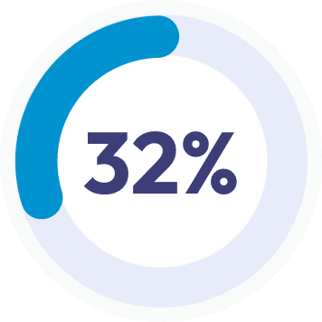
Just 32% of full and part-time U.S. employees are engaged at work.

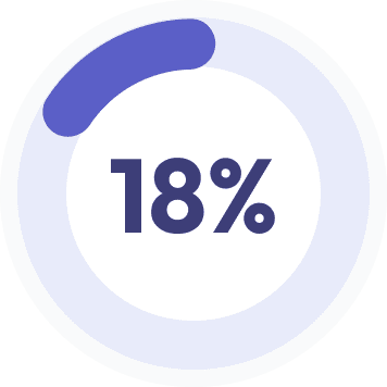
While 18% of employees are actively disengaged.

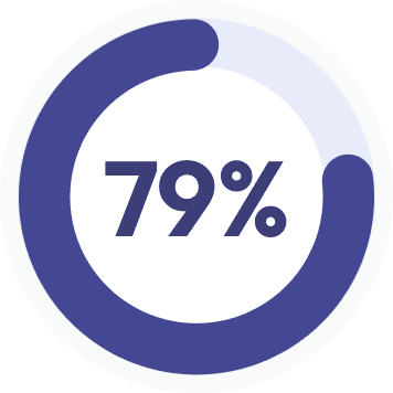
For remote and hybrid workers, 79% said they had grown distant from their teams and find it harder to feel connected.
While it is possible to foster connection and community in a virtual environment, it requires greater intentionality. That’s where Everything DiSC® on Catalyst™ comes in.
Catalyst is a self-development platform that helps people and teams work better together through the power of Everything DiSC, a leading behavioral assessment tool. In response to the evolving digital workplace and a decline in employee engagement, our team identified a crucial need for integrating Everything DiSC on Catalyst into the flow-of-work of our learners by bringing DiSC content into tools that they are already using in their workday such as Microsoft Teams, Outlook, and Slack.
Catalyst is competing against so many other priorities that our learners have in their workday. What’s standing in the way of Catalyst becoming the culture management tool in an organization, is learners having the time and experience with the DiSC model to use it in their everyday life. The flow-of-work integration must be easy to use and clearly relevant in the learners’ lives to prove its value and overcome the time pressure for learners to use it.
How might we seamlessly integrate the benefits of Everything DiSC on Catalyst into the flow-of-work that our learners are already engaging in?
A Microsoft Teams meeting app that seamlessly incorporates Everything DiSC content in real-time without disrupting the user's flow-of-work.
While employee engagement seems to be falling year over year, usage of digital communication tools is on the rise. The Microsoft Teams platform has shown a remarkable increase in its user base from its inception in 2017, growing from 2 million to a staggering 300 million in 2023. Currently, over 1 million organizations are using Microsoft Teams, including 91% of Fortune 100 companies.
Microsoft Teams is also the most popular enterprise communication tool among our clients. Over 84% of organizations that use our products are also using Teams and other Microsoft Office apps as their default solutions.
In addition to its wide reach, Microsoft Teams has an extensive list of features and customizations that could be leveraged for our use case. Microsoft Teams gives its users the ability to create custom apps that integrate their features seamlessly.
While we want to expand Everything DiSC content to other platforms, we felt confident that starting with a Teams integration would provide the most value to our users and would allow us to gain valuable experience before tackling on the next integration.
The features that piqued our interest included:
Now that we have identified which platform we wanted to focus our integration on, I embarked on a research journey. We needed to understand what our competitors were doing and see how they were leveraging the Teams platform for their content.
While Everything DiSC has several competitors, we only focused on the ones who were also expanding into integrations with other platforms. We looked at the following:
A common theme that emerged from looking at the competitive landscape is the ability to generate personalized insights of your team to prepare for meetings and to get a better understanding of your team behaviors. One feature that really stood out was the real-time access during a video call to colleague styles and a customized selection of tips to guide the conversation depending on the subject.
Since our goal is to improve communication and engagement for our learners, we wanted to focus on features that would allow us to connect DiSC insights with real world applications, so developing a meeting extension was one of the clear frontrunners.
Before we could start designing the meeting extension, I wanted to learn more about the landscape of meetings in the post-COVID era. It’s clear that in the last few years there’s been a significant rise in virtual meetings. According to the State of Video Conferencing Report by Dialpad,
When asked about their biggest pain points when it comes to virtual meetings, the second largest pain point, reported by about 33% of respondents was:
In addition, the majority of respondents have engaged in “off-task” behaviors during virtual meetings. The top ones included checking emails, cellphone use, multitasking, snacking, social media, and surfing the internet.
When taking into account these statistics, we want our integration feature to add to the meeting experience and not create another reason for people to dread virtual meetings.
Who is our user? Any of the 600K+ learners on Catalyst! But realistically, this integration would be targeted at learners who are part of a larger organization who has a critical mass of users on Catalyst.
A secondary audience will be IT stakeholders in partner organizations—we need to design the integration so that it meets the needs and standards of this audience as well (e.g., privacy, data security, accessibility, etc.)
Because Everything DiSC is not a direct-to-consumer product, we work through a partner network to get our products to our learners. Partners check in with us and report on pain points, what’s working, and what we can do to improve the user experience of our products. The idea for this project stemmed from some of the pain points that our partners have been identifying:
People don’t have enough time in their day for soft-skill development. They’re interested in what Everything DiSC on Catalyst has to offer, but often struggle with the balance of work demands and the time needed for personal development.
About 68% of feedback related to our users being intimidated by the amount of content that Catalyst provides. A lot of users don’t know where to begin and some feel that they become lost in the content on our platform, especially when they are going in there without a specific problem to solve.
Over 70% of feedback related to our users wanting to better understand their team members, but they wanted insights into their teams quickly, and didn’t want to go through the process of pulling up the Catalyst website, logging in, having to search up the colleague, and spend time on the lengthy colleague comparison page, looking for relevant information.
Whew, we’re finally getting somewhere. After reviewing the landscape of digital communication tools, what our competitors are doing, and what our user pain points are with our platform, I narrowed down a list of take-aways to keep in mind as we design and develop the Catalyst meeting extension Teams app.
One key difference for this project was using not only the branding and UI of Everything DiSC on Catalyst, but also following best practices and style guidelines of Microsoft Teams. What’s great about Teams is that they make an extensive UI kit available to designers and developers. While this allowed me to speed up prototyping by using existing templates, it also kept me within certain design constraints and limitations.
The reality of a meeting extension is that you get very limited real estate for your content so you have to be very intentional about what you are including in the design and how many interactions you are allowing.
Using the UI kit as a base, I started exploring different design ideas while keeping in mind our user pain points. I want our learners to:
This design takes inspiration from the colleague cards – which we know is one of our most popular features on the Catalyst platform – but it is simplified to only include the style, DiSC halo, photo, and the name of the colleague. Clicking on a name would take the learner to a simplified version of the colleague comparison page, which currently exists on the Catalyst platform. Since the iframe that we can work with is only 280px wide, we have to truncate the content and include the most poignant facts and details. I want the learner to get just enough information to help them navigate conversations during calls and to satisfy their curiosity about colleagues who they might not know very well.
Potential problems: This type of grid layout might get overwhelming if there are a lot of people on the call. This also doesn’t address the pain points of those learners who want a quick overview of their colleagues since they would have to go into each to read about that colleague’s style and different behavior tendencies.
Incorporating a Group Map experience. Since this app will primarily be utilized during team calls with 2 or more people, we wanted to bring back the “Your Groups” feature that we recently launched on Catalyst. This would allow the learner to get a snapshot of a group DiSC map with their colleagues plotted according to their style. They would then get a list view of the group map, and the ability to see more in-depth information when they click on a particular colleague. Like in the “Your Groups” feature, the learners would also have access to tabs to learn about the different behavioral styles, team dynamics, and even get tips on navigating several conversation topics.
Potential problems: Too heavy on content. The idea was to re-create the recently launched Your Groups experience in Teams, but this is far too complex for the space we have within the meeting environment and would also distract from the call itself. The group map currently doesn’t scale well, so if there are a lot of people on the call, it would essentially become meaningless. This does not satisfy the majority of the pain points that our learners have and mainly focuses on those who prefer a lot of content and are avid Catalyst users.
Simplified list and a summarized view of the “colleague comparison page” which is currently the most popular destination on the Catalyst platform. From the list, the learners can quickly identify their colleagues’ styles along with their strengths and challenges. This would create an “at a glance” understanding of their DiSC profile and could help them navigate the meeting and their conversations. For those learners who want to know more, they can click on a colleague they are interested in and would be presented a selection of strengths, challenges, tips, and some ideas on how to work with the colleague in different situations. By understanding colleague styles, it creates an understanding of the team as a whole and promotes a more open and collaborative environment.
Potential problems: Even though we shortened the amount of content available directly in Teams, it could still be too distracting for some learners during video calls. Research on video call behaviors has shown that most employees already engage in “off-task” behaviors so this could be another avenue to check out of the call. There should be a balance of content specific to the people in the call not to detract from the meeting agenda and flow of the meeting.
Now that we had a few avenues for how to approach our problem, I worked closely with our Research team to create and administer a user test on the designs. Over the span of a week, we conducted individual video calls with 13 participants in which they were presented different prototypes and asked to accomplish specific tasks. Our list of questions and task prompts included:
Identify Laurence’s strengths and challenges and explain your thoughts.
Can you find yourself on the group map?
How would you use the strengths and challenges that you see?
How would you search for a colleague in the meeting?
Where would you find information about how you and Laurence relate to each other?
Overwhelmingly, 77% of participants gravitated toward Idea 3. The most impactful page being the initial list with the strengths and challenges presented. What participants said:
“This is super easy to use, I can right away see my teammates and their styles. If I need more info, I can pick who I want and explore more.”
“I like that you get the strengths and challenges right away, it gives you an idea about what that person is about if you don’t know them well.”
“I think it’s great that you have the option to get a quick glance at your team makeup or zget even more information on them if you choose to.”
“There are so many times where I don’t feel like I need to be in the meeting, so this is a fun tool to still do something work related, but also fun to explore your colleagues.”
After the interviews, we created a list of finding and identified some common themes and recommendations.
Finding 1
Group Map was too overwhelming to process in such a small space, but wondered if they could have access to it before or after the meeting. They liked having the individual maps when you clicked on more information.
Recommendation: Keep individual maps but put a group map in the content meeting tab that users get access to before and after meetings. That way, they can familiarize themselves with the overall team composition, but in a much more appropriately sized window.
Finding 2
Participants want a quick summary of a person’s style on the first page of the meeting app. It helps them to get a rough understanding of who they are or will be talking to especially if it’s a new or unfamiliar colleague.
Recommendation: Keep 1 strength and 1 challenge as part of the initial list, but add more on the following pages for those who want a deeper dive.
Finding 3
While participants found Idea 3 very intuitive to use, they asked about how they would access this content. Participants wondered whether they would have to download this app themselves, add it to the meeting, or whether this will be done automatically for them.
Recommendation: We already know that a big challenge will be user access to this app. We are working with the integration partners at Wiley, the developers, as well as the brand team to develop a strategy for working closely with our client organizations and specifically the Teams admins at those organizations so that our app is part of an org-wide rollout and users would have the app automatically added to their account. There will still need to be training and onboarding. It will especially be important to get managers and team leaders involved as this would be a great tool for them to introduce to their teams.
Currently, our developers are hard at work building the Teams app. Our target date for a soft launch is May 2024. In the meantime, I’m working closely with our Architect, Integrations Partner, Product Technology Lead, Product Managers, and a variety of Developers to make sure that we’re staying on track and answering any design-related questions and performing User Acceptance Testing.
We’re also creating plans for tracking usage and developing success metrics so that we can evaluate the performance of our app. Because the integrations market is new for us, we want to get our first launch right and from there, expand into other applications. Through this initial development phase and being the lead UX designer, I’ve learned quite a bit:


